


TehoTrio
2026
//Tools used - InDesign, Illustrator
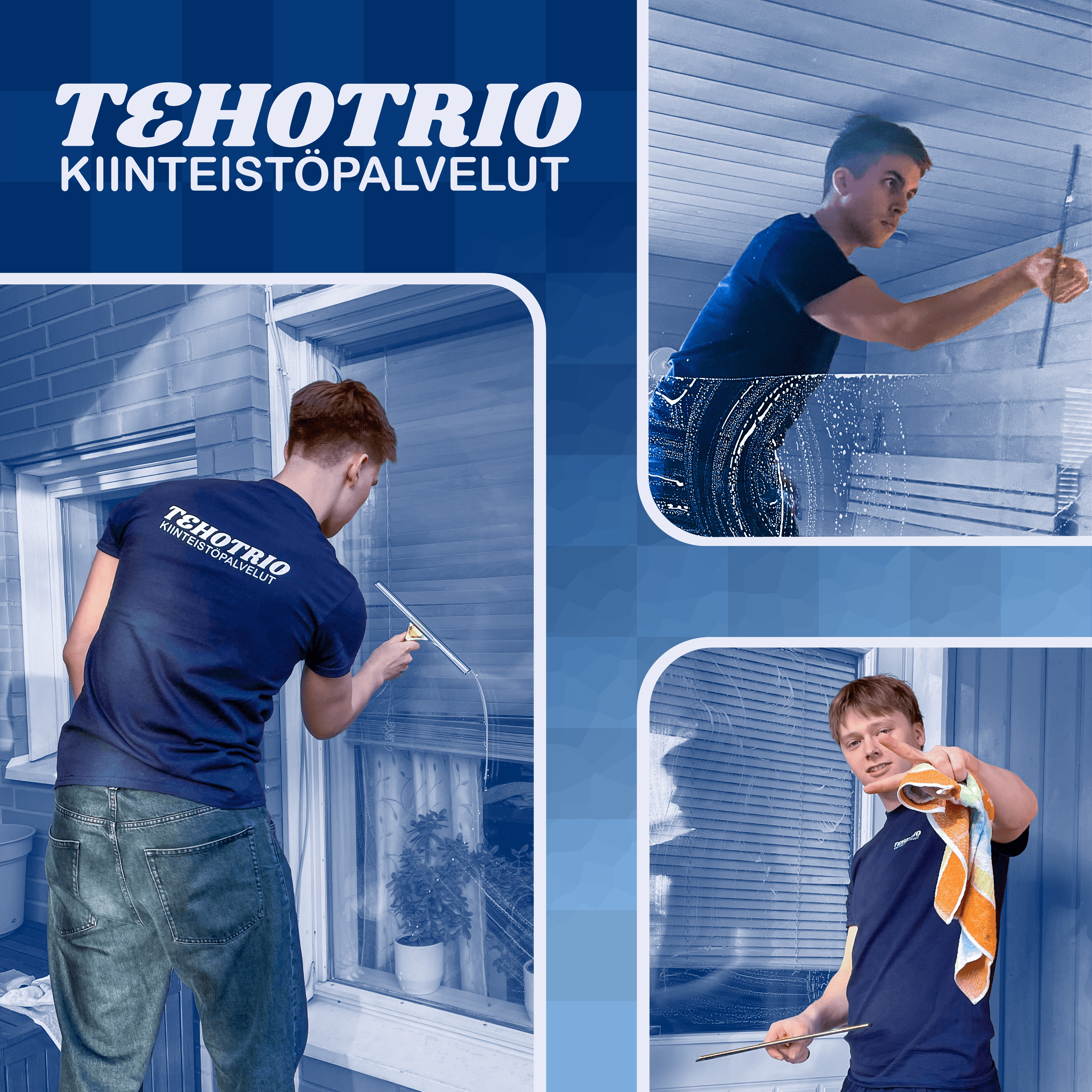
This branding identity for the property maintenance company “TehoTrio” balances a clean and modern aesthetic with recognizable industry elements to create a standout look. Drawing inspiration from the Finnish flag, the primary color palette reflects it. The forward-leaning logotype conveys speed and efficiency, while the letter ‘E’ incorporates an inverted ‘3’ as a subtle nod to the ‘Trio’ in the company name.
TehoTrio
2026
//Tools used - InDesign, Illustrator
This branding identity for the property maintenance company “TehoTrio” balances a clean and modern aesthetic with recognizable industry elements to create a standout look. Drawing inspiration from the Finnish flag, the primary color palette reflects it. The forward-leaning logotype conveys speed and efficiency, while the letter ‘E’ cleverly incorporates an inverted ‘3’ as a subtle nod to the ‘Trio’ in the company name.
TehoTrio
2026
//Tools used - InDesign, Illustrator
This branding identity for the property maintenance company “TehoTrio” balances a clean and modern aesthetic with recognizable industry elements to create a standout look. Drawing inspiration from the Finnish flag, the primary color palette reflects it. The forward-leaning logotype conveys speed and efficiency, while the letter ‘E’ cleverly incorporates an inverted ‘3’ as a subtle nod to the ‘Trio’ in the company name.
© 2026 Riku Rinta-Huumo. All rights reserved.
© 2026 Riku Rinta-Huumo. All rights reserved.
TehoTrio
2026
//Tools used - InDesign, Illustrator
This branding identity for the property maintenance company “TehoTrio” balances a clean and modern aesthetic with recognizable industry elements to create a standout look. Drawing inspiration from the Finnish flag, the primary color palette reflects it. The forward-leaning logotype conveys speed and efficiency, while the letter ‘E’ incorporates an inverted ‘3’ as a subtle nod to the ‘Trio’ in the company name.
TehoTrio
2026
//Tools used - InDesign, Illustrator
This branding identity for the property maintenance company “TehoTrio” balances a clean and modern aesthetic with recognizable industry elements to create a standout look. Drawing inspiration from the Finnish flag, the primary color palette reflects it. The forward-leaning logotype conveys speed and efficiency, while the letter ‘E’ cleverly incorporates an inverted ‘3’ as a subtle nod to the ‘Trio’ in the company name.
TehoTrio
2026
//Tools used - InDesign, Illustrator
This branding identity for the property maintenance company “TehoTrio” balances a clean and modern aesthetic with recognizable industry elements to create a standout look. Drawing inspiration from the Finnish flag, the primary color palette reflects it. The forward-leaning logotype conveys speed and efficiency, while the letter ‘E’ cleverly incorporates an inverted ‘3’ as a subtle nod to the ‘Trio’ in the company name.
© 2026 Riku Rinta-Huumo. All rights reserved.